

Oase relaunches its corporate design on October 4, 2021. The complete updated appearance, which also replaces the logo that has existed since 2006, expresses the strong evolution of the Oase brand. With this relaunch and a strong vision, the company underlines its position as market leader with innovative strength and passion for water.
We create the right flow – From October 4, 2021 the Oase brand will present itself with this strong vision and a completely renewed corporate design. For decades, the name Oase has stood for inspiring ideas around water – from compact aquariums to large-scale swimming ponds and fountain systems. Since 2006, the brand has been identified by its characteristic water droplet logo. After 15 years, it has now been replaced by the new corporate design, with a modern and expressive appearance that reflects Oase’s leading role in the industry.
CEO Thorsten Muck, who has led the company since May 2017, explains:
“Oase has developed enormously in recent years. As a global company, we are active in over 100 markets. At the same time, our approach has grown wider and deeper, and our product range has grown significantly. The new corporate design underlines this evolution, our attitude and our dynamism.“
This innovative strength as well as the passion for water is reflected in the new corporate design and the meaningful statement “We create the right flow”.
“We combine the proven Oase quality with the Oase feeling of life; now in a visual statement. For us, this feeling describes the fascination of water, the desire to create and the diversity of water within a living space; as a retreat, a source of inspiration or social meeting place.”
Thorsten Muck emphasizes.
Along with the new corporate design, Oase has defined the new brand values with an emphasis of the customer at the center, with German Engineering second. The third value is the mindset of seeing water as invigorating as well as calming, an element that stands for an attitude to life, introspection, recreation, experience and the environment.
The new brand logo:
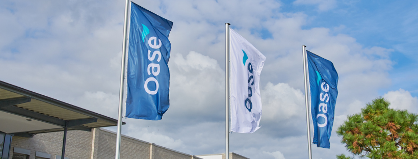
The core element of the relaunch is the new brand logo, which will represent the brand worldwide from October.
“Developing a coherent logo for a global company that also visually conveys our vision in all markets and on all channels is a complex undertaking that we have worked on intensively over the past 18 months,”
explains Marketing Director Matthias Oetting, who oversees this project.
“As the centerpiece of the revised appearance, the new logo embodies our claim and our values in an ideal way, with our Oase Flow as a central element.”
The wordmark is defined by the clear typography, which embodies the brand‘s German Engineering. The details of the typeface are again a homage to water in their subtle roundings, as is the colour scheme.

The wordmark is complemented by the energetic flowing wave – the Oase Flow, which replaces the water droplets. The graphic element is based on the alchemical symbol for water and represents dynamic creativity.
“Flowing, but self-confident. Clear, but organic – that’s how we see ourselves. And that‘s exactly what our new image underlines,”
Matthias Oetting sums up. And Thorsten Muck states:
“The new corporate design is a milestone that perfectly expresses our market leadership and our claim as a modern, innovative company.”
With the new brand relaunch at Oase, comes a new logo for Atlantic-Oase as well! We’re happy to announce the change of our logo to connect and grow with Oase’s vision for the future. You’ll start to see the new logo’s for Oase and Atlantic-Oase as we begin this next chapter together in the water feature industry!